Here’s a quiz for you: What do these three sets of playing cards have in common?

As much as I detest cigarettes, and the companies that make them, those companies made some killer decks of cards. Each of these sets is a promotional item from well known cigarette brands. Most promotional decks feature simply the brand and logo of a certain smoke; the handling and quality is nothing special. But these three decks stand out for their unique design and superb handling.
Plain-jane Bees with a beautiful back

First up: A double deck of Bee playing cards released by the R.J. Reynolds Tobacco Company. The faces are nothing special: It’s a Bee deck. Almost duplicate jokers (I really hate that small star), standard ace and faces.
What’s unique about this deck is the back. This deck was given out with Camel cigarettes in 2007, and it was a hit with card mechanics who were seeking a superior card stock with a colorful back — most of the custom decks at the time featured black or white designs. The red deck in particular inspired the nickname “watermelon,” so these got to be known rather quickly as watermelon Bees. The bold color choices, combined with its thick stock, made this deck pretty hot to handle.
The box is unique as well: For a deck given out with Camels, there’s not one mention of that brand. The deck comes in a simple black box with yellow pips and the back design on both faces. That makes this a cig deck I don’t mind taking out in public.
High-qualilty deck for discount cigs

Next up is a deck that I think is a hidden gem among collectors. Your Basic Deck accompanied Basic cigarettes, which are a cheaper, lower-quality brand (only reason I know that is because of Wikipedia). While the cigarettes may be low-quality, the cards are on the other end. They feature a superior stock that glides and fans beautifully.
I’m going to date this deck as being printed in 1997 — that T in the code on the bottom of the ace is a dating system used by the U.S. Playing Card Company. However, the company printed the deck using the pips and faces of Arrco playing cards, a Chicago-based manufacturer that USPCC acquired 10 years earlier. The Arrco faces are appreciated by collectors because they are traditional, yet different from the standard face cards used by the USPCC. (When The Blue Crown published its Blue Crown deck, it used the Arrco faces as a selling point.) Those diamond pips look pretty slick, for a basic deck.

Your Basic Deck comes with a basic ace of spades — doesn’t get much more basic than that. Same for the jokers and the backs. As well as the cards fan, they don’t look good in a fan. Just a white blob. But this is still a unique deck worthy of some attention.
Deck pushes design a long way, baby

Collectors know all about the Virginia Slims deck. Easily one of the most cleverly designed decks on the market, the Slims handle well and are absolutely gorgeous.
True to its name, the cards are slim. But the smooth finish is impeccable. Printed in 1985, the card backs feature the brand’s signature slogan, “You’ve come a long way, baby.” Because the brand was one of the first to market specifically to women, an ad card inside celebrates women’s progress, and how women weren’t even allowed to play cards, or smoke cigarettes, in olden times. (Can you think of a better way to celebrate women’s fight for equality than by inhaling carcinogens? I can’t, either!)

What makes this deck a gem are the faces. Each card features Victorian etchings around the indices, giving each card the look of a picture frame. The pips of the spot cards are arranged more symmetrically and circularly than traditional layouts. And the court cards are Victorian photos of women dressed as royalty, even the kings and jacks. Of course, the joker is a dude with a dumbass grin and a handlebar grill. And a double-deck set comes in a sleeve that looks like a big version of the red box. It’s a great find to score one of those.
Premium promos go far, especially with cards
These kind of decks take some searching — well, for me, anyway. I don’t shop for cigs, so I never see the packs with the decks. I discovered the watermelon Bees from Internet buzz, but the Basic and Slims decks I found at flea markets. But all three of these decks show in some form that when companies put some thought into the functionality of a deck, they create things that survive the test of time.
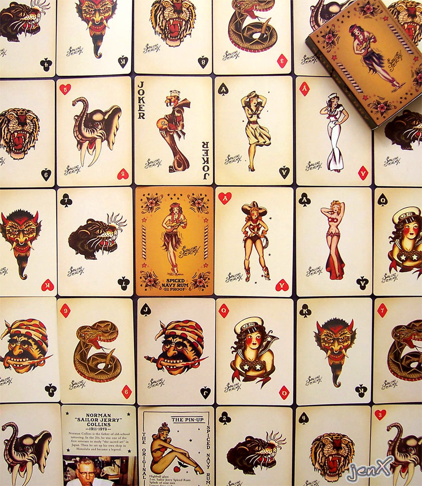
Think about the decks of cards with beer or soda logos that you can buy in a drugstore, then compare them to the decks by Johnny Cupcakes, Sailor Jerry or JAQK Cellars. The interpretations of traditional icons allow a company to personalize its brand, and investment into good cardstock will keep the cards around for a much longer time. They almost become keepsakes to people who don’t normally collect cards.
